


hobbyパッケージを使用して、点を通る滑らかな曲線をプロットしたいと思います。s pgf'smooth関数が正しく動作しません。私のコードは次のとおりです。
\documentclass{standalone}
\usepackage{pgfplots}
\usepackage{filecontents}
\pgfplotsset{compat=1.9, every tick label/.append style={font=\normalsize}}
\pgfplotscreateplotcyclelist{my black white}{%
solid,smooth, every mark/.append style={solid, fill=white}, mark=triangle*\\%
solid, every mark/.append style={solid, fill=black}, mark=triangle*\\%
densely dashed, every mark/.append style={solid, fill=white},mark=diamond*\\%
densely dashed, every mark/.append style={solid, fill=black}, mark=diamond*\\%
}
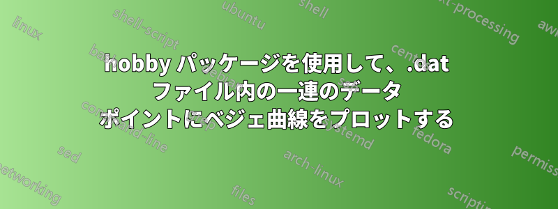
\begin{filecontents}{p2.dat}
SAT ETCY-5 ETCX-5 ETCY-10 ETCX-10 AR-5 AR-10
100 0.46 0.50 0.54 0.61 0.17 0.25
90 0.45 0.48 0.53 0.59 0.18 0.25
80 0.43 0.47 0.51 0.58 0.19 0.27
70 0.41 0.45 0.49 0.57 0.21 0.30
60 0.39 0.44 0.48 0.55 0.25 0.35
50 0.37 0.42 0.46 0.54 0.30 0.44
40 0.35 0.40 0.44 0.52 0.38 0.57
30 0.33 0.37 0.42 0.51 0.50 0.71
20 0.29 0.34 0.39 0.48 0.63 0.87
10 0.24 0.29 0.34 0.45 0.78 1.04
0 0.18 0.23 0.29 0.41 0.92 1.22
\end{filecontents}
\begin{document}
\pgfplotstableread{p2.dat}{\2}
\begin{tikzpicture}
\begin{axis}[
cycle list name=my black white,
title={Compressing Pressure: 0.2 MPa},
enlarge x limits=-1,
xmin=0, xmax=100,
xlabel={Water Saturation($S_w$)},
xtick={0,10,20,30,40,50,60,70,80,90,100},
xticklabels={0,10,20,30,40,50,60,70,80,90,100},
scaled ticks=true,
ymin=0, ymax=0.7,
ylabel={Avg. ETC \quad $\frac{K_{eff}}{K_s}$ $(Dimensionless)$},
legend style ={ at={(0.25,0.4)},
anchor=north west, draw=none, font=\normalsize,
fill=white,align=left},
smooth
]
`
\addplot table [x={SAT}, y={ETCX-5}] {\2};
\addlegendentry{$K_{eff(x)}-Overlap \quad 5\% $};
\addplot table [x={SAT}, y={ETCY-5}] {\2};
\addlegendentry{$K_{eff(y)}-Overlap \quad5\% $};
\addplot table [x={SAT}, y={ETCX-10}] {\2};
\addlegendentry{$K_{eff(x)}-Overlap \quad10\% $};
\addplot table [x={SAT}, y={ETCY-10}] {\2};
\addlegendentry{$K_{eff(y)}-Overlap \quad10\% $};
\end{axis}
\end{tikzpicture}%
\end{document}
hobby曲線の滑らかさが一定ではありません。パッケージを使用してファイル内のデータを使用して滑らかな曲線を作成する方法があるかどうか疑問に思っています。私の見方では、描画にはデータポイントではなく絶対座標が使用されています.dat。hobby
答え1
ライブラリのマニュアルに記載されているようにhobby、 での使用をサポートしています。プリアンブルに次のようpgfplotsに追加するだけです。\usetikzlibrary{hobby}
\addplot +[hobby] {rnd};
したがって、smoothコード内で を に置き換えるとhobby機能します。
そうは言っても、私は自分でこれを行うつもりはありません。デフォルトの線形補間からほとんど変更はありません。
凡例エントリと ylabel に加えた変更にも注意してください。
\documentclass[border=5mm]{standalone}
\usepackage{pgfplots}
\usetikzlibrary{hobby}
\usepackage{filecontents}
\pgfplotsset{compat=1.9, every tick label/.append style={font=\normalsize}}


\pgfplotscreateplotcyclelist{my black white}{%
    solid,smooth, every mark/.append style={solid, fill=white}, mark=triangle*\\%
    solid, every mark/.append style={solid, fill=black}, mark=triangle*\\%
    densely dashed, every mark/.append style={solid, fill=white},mark=diamond*\\%
    densely dashed, every mark/.append style={solid, fill=black}, mark=diamond*\\%
}

\begin{filecontents}{p2.dat}
SAT ETCY-5  ETCX-5  ETCY-10 ETCX-10 AR-5    AR-10
100 0.46    0.50    0.54    0.61    0.17    0.25
90  0.45    0.48    0.53    0.59    0.18    0.25
80  0.43    0.47    0.51    0.58    0.19    0.27
70  0.41    0.45    0.49    0.57    0.21    0.30
60  0.39    0.44    0.48    0.55    0.25    0.35
50  0.37    0.42    0.46    0.54    0.30    0.44
40  0.35    0.40    0.44    0.52    0.38    0.57
30  0.33    0.37    0.42    0.51    0.50    0.71
20  0.29    0.34    0.39    0.48    0.63    0.87
10  0.24    0.29    0.34    0.45    0.78    1.04
0   0.18    0.23    0.29    0.41    0.92    1.22
\end{filecontents}

\begin{document}

\pgfplotstableread{p2.dat}{\2}

\begin{tikzpicture}
\begin{axis}[
cycle list name=my black white,
title={Compressing Pressure: 0.2 MPa},
xmin=0, xmax=100,
xlabel={Water Saturation($S_w$)},
xtick distance=10,
ymin=0, ymax=0.7,
ylabel={Avg. ETC \quad $\frac{K_{\mathrm{eff}}}{K_s}$ (Dimensionless)},
legend style ={ at={(0.25,0.4)},
    anchor=north west, draw=none, font=\normalsize,
    fill=white,align=left,
    cells={anchor=west} %% <-- added
},
hobby
]


\addplot  table [x={SAT}, y={ETCX-5}] {\2};
\addlegendentry{$K_{\mathrm{eff}(x)}$ -- Overlap 5\% };

\addplot  table [x={SAT}, y={ETCY-5}] {\2};
\addlegendentry{$K_{\mathrm{eff}(y)}$ -- Overlap 5\% };

\addplot  table [x={SAT}, y={ETCX-10}] {\2};
\addlegendentry{$K_{\mathrm{eff}(x)}$ -- Overlap 10\% };

\addplot  table [x={SAT}, y={ETCY-10}] {\2};
\addlegendentry{$K_{\mathrm{eff}(y)}$ -- Overlap 10\% };

\end{axis}
\end{tikzpicture}%
\end{document}