


チャネル全体で測定されたプローブからの速度データをプロットしようとしています。
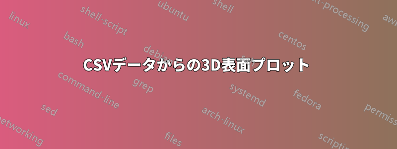
目標は、測定されたポイントにまたがり、速度値 (v) に応じて色付けされ、上から見たサーフェスです (「カラーマップ」のように?)。ポイント間のシェーディングも含まれます。1 日かけて試行錯誤した結果、私が思いついた最良の結果を以下に示します。ポイント間のシェーディングはまだありません。
のパラメータを置き換えると、addplot3状況surfは悪化します。
\documentclass{article}
\usepackage{pgfplots, filecontents}


\begin{filecontents*}{04_v_plot.csv}
depth,column,v
0.05,0.025,3.797153190429337
0.1,0.025,3.726861900740809
0.15,0.025,3.5359111045962095
0.2,0.025,3.4128410835129053
0.25,0.025,3.140235925631795
0.05,0.1,4.243357377017983
0.1,0.1,4.1459069835908196
0.15,0.1,3.9166226281025893
0.2,0.1,4.106142900384007
0.25,0.1,3.4708819672783275
0.05,0.175,4.132121899523459
0.1,0.175,3.768785853709482
0.15,0.175,3.345251163711442
0.2,0.175,3.2543256435843415
0.25,0.175,2.7823975289356344
\end{filecontents*}

\begin{document}

\begin{figure}
  \centering
  \begin{tikzpicture}
    \begin{axis}[
      xlabel={Horizontal position},
      ylabel={Depth},
      colorbar,
      y dir=reverse,
      ymin=0,
      ymax=0.3,
      xmin=0,
      xmax=0.2,
      view={0}{90},
      ]

      \addplot3+[scatter, only marks] table[x=column,y=depth,z=v,col sep=comma]{04_v_plot.csv};
    \end{axis}
  \end{tikzpicture}
  \caption{Velocities at positions}%
\end{figure}

\end{document}
元の csv からデータを再配置しました:
depth,A,B,C
0.05,3.797153190429337,4.243357377017983,4.132121899523459
0.1,3.726861900740809,4.1459069835908196,3.768785853709482
0.15,3.5359111045962095,3.9166226281025893,3.345251163711442
0.2,3.4128410835129053,4.106142900384007,3.2543256435843415
0.25,3.140235925631795,3.4708819672783275,2.7823975289356344
元の csv ファイルを読み込んでデータをプロットすることは可能でしょうか?
答え1
Asymptote解決:
// csv-colormap.asy
//
// run
//    asy csv-colormap.asy
//
// to get a standalone image in csv-colormap.pdf
//
settings.tex="pdflatex";
size(12cm,12cm);
import graph;
import palette;
import colorbrewer;
import fontsize;defaultpen(fontsize(8pt));
texpreamble("\usepackage{lmodern}"+"\usepackage{amsmath}"
            +"\usepackage{amsfonts}"+"\usepackage{amssymb}");
file fin=input("04_v_plot.csv").csv();
string[] s=fin.line(); // skip the title line
real[][] A=fin;
A=transpose(A);
real[] x=A[0];
real[] y=A[1];
real[] z=A[2];

pen[] Palette=Blues9;

picture bar;
bounds range=image(x,y,z,Palette);

palette(bar,rotate(90)*"Velocity",range,(0,0),(0.5cm,5.3cm)
          ,Right,Palette,PaletteTicks("$%+#.1f$"));
add(bar.fit(),point(E),30E);

xaxis("Horizontal position",BottomTop,LeftTicks(Step=0.05,step=0.01),above=true);
yaxis("Depth",LeftRight,RightTicks(Step=0.05,step=0.01),above=true);

このコードはBlues9、
カラーブリューワー、これは
シンシア・ブリューワー教授のカラースキーム
漸近線のペン配列として。もちろん、他の適切なパレットに置き換えることもできます。