


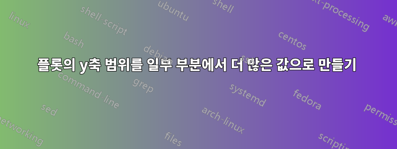
아래 MWE의 경우:
\documentclass{report}
\usepackage[left=2.5cm,right=2cm,top=2cm,bottom=2cm]{geometry}
\usepackage[T1]{fontenc}
\usepackage{pgfplots}


\begin{document}

\begin{figure}[H]
\begin{tikzpicture}
\begin{axis}[%
scaled y ticks = true,
width=1*\textwidth,
height=8cm,
xlabel={Query $\#$},
ylabel={Elapsed Time (in seconds)},
grid=both,
minor x tick num=5,
minor y tick num=5,
enlarge x limits=0,
legend entries={Original, byHalf, Random, Hybrid},
scaled x ticks = true
]
\addplot [
color=blue,mark=x,
solid,
line width=1.0pt
]
coordinates{
(0,39.0819) (1,2292) (2,4484.82) (3,6057.37) (4,38.3475) (5,15.4616) (6,38.5286) (7,15.411) (8,38.3627) (9,14.8773) (10,15.4079) (11,38.8762) (12,20.9027) (13,35.6657)
};

\addplot [
color=red,mark=x,
solid,
line width=1.0pt
]
coordinates{
(0,38.9575) (1,2720.19) (2,1929.3) (3,1677.22) (4,111.165) (5,68.6833) (6,94.4457) (7,76.0591) (8,94.0201) (9,109.844) (10,78.6465) (11,91.7805) (12,12.9179) (13,78.6684)
};


\end{axis}
\end{tikzpicture}
\end{figure}

\end{document}
컴파일해 보면 플롯의 마지막 부분이 선들이 서로 닿아 있는 것처럼 보이고 동일한 것처럼 보이지만 실제로는 그 사이에 약 50초가 있는 것을 볼 수 있습니다. 이는 y축 틱이 1000단계씩 (자동으로) 진행되기 때문에 발생합니다.
이것을 어떻게 제어할 수 있나요? 먼저 100단계로 진행한 다음 1000단계에 도달하면 1000단계로 전환할 수 있습니까?
답변1
현재 사용하는 축은 선형입니다. 즉, 0과 1000 사이에 더 많은 점을 추가하면 같은 거리에 선과 레이블만 더 추가하게 됩니다(0과 1000 사이의 거리는 여전히 동일합니다).
0과 1000 사이의 차이를 강조하려면 로그 눈금을 사용할 수 있습니다. 로그 눈금을 사용하면 0과 10 사이의 거리는 10과 100 또는 100과 1000 사이의 거리와 같습니다.
로그 y축을 사용하는 예는 다음과 같습니다.

\documentclass{report}
\usepackage[left=2.5cm,right=2cm,top=2cm,bottom=2cm]{geometry}
\usepackage[T1]{fontenc}
\usepackage{pgfplots}


\begin{document}

\begin{figure}[H]
  \begin{tikzpicture}
    \begin{semilogyaxis}[%
      width=1*\textwidth,
      height=8cm,
      xlabel={Query $\#$},
      ylabel={Elapsed Time (in seconds)},
      grid=both,
      enlarge x limits=0,
      legend entries={Original, byHalf, Random, Hybrid},
      scaled x ticks = true
    ]
    \addplot [color=blue,mark=x,solid,line width=1.0pt]
      coordinates{
        (0,39.0819) (1,2292) (2,4484.82) (3,6057.37) (4,38.3475) (5,15.4616) (6,38.5286) (7,15.411) (8,38.3627) (9,14.8773) (10,15.4079) (11,38.8762) (12,20.9027) (13,35.6657)
   };

    \addplot [color=red,mark=x,solid,line width=1.0pt]
      coordinates{
       (0,38.9575) (1,2720.19) (2,1929.3) (3,1677.22) (4,111.165) (5,68.6833) (6,94.4457) (7,76.0591) (8,94.0201) (9,109.844) (10,78.6465) (11,91.7805) (12,12.9179) (13,78.6684)
    };
  \end{semilogyaxis}
\end{tikzpicture}
\end{figure}

\end{document}
사용하는 대신
\begin{semilogyaxis}
...
\end{semilogyaxis}
당신은 또한 사용할 수 있습니다
\begin{axis}[xmode=normal,ymode=log]
...
\end{axis}
더 많은 설정과 정보를 보려면pgfplots문서화(16-19페이지).