


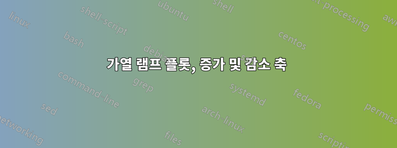
먼저 이 이름을 영어로 올바르게 지정하는 방법을 모른다는 점을 분명히 하겠습니다. 제목을 수정하거나 댓글을 남겨주세요.
가열 및 냉각(Tr)이 동일한 축에 표시되는 방식으로 이 데이터를 플롯해야 하며같은 방향. 그림을 참조하세요. x축을 900으로 이동한 다음 다시 줄이면서 왼쪽에서 오른쪽으로 이동하는 방법을 찾을 수 없습니다.
시간(t)으로 그래프를 그려야 원하는 결과를 얻을 수 있지만 온도를 표시하는 축이 필요합니다.
나는 두 개의 플롯으로 나누어 미러링하려고 시도했지만 앞으로 이와 같은 다른 플롯을 사용하면 너무 많은 시간이 걸릴 것입니다. 너무 우아하지도 않고 복잡한 곡선의 경우 시각적인 측면도 좋지 않습니다.

\documentclass[]{standalone}

    % UNITS
\usepackage{siunitx}
\sisetup{per-mode=fraction, abbreviations}

    % GRAPHICS
\usepackage{pgfplots}
\pgfplotsset{width=9cm,height=6cm,compat=newest}

% Style to select only points from #1 to #2 (inclusive)
\pgfplotsset{select coords between index/.style 2 args={
        x filter/.code={
            \ifnum\coordindex<#1\def\pgfmathresult{}\fi
            \ifnum\coordindex>#2\def\pgfmathresult{}\fi
        }
}}

\usepackage{filecontents}

\begin{filecontents}{datax.dat}
t,HF,Gewicht,Normal,DTG,Tr
574,1.20838,8.47718,0.981320918,-0.00509898,67.8333
3794,27.9521,2.06633,0.239198985,-0.009580838,372.333
6944,6.17274,0.420004,0.04861979,0,897.333
6964,3.65761,0.419016,0.048505419,0,900
7424,-19.0714,0.413001,0.047809121,0,900
13984,-28.3111,0.367016,0.0424858830,900
15194,-4.02426,0.321001,0.037159173,0,727.667
17074,28.3149,0.190241,0.022022356,0,414.333
18914,13.0023,-0.164632,-0.01905785,0,107.667
\end{filecontents}

\begin{document}
{\footnotesize
\begin{tikzpicture}
    \bigskip

\pgfplotsset{
scale only axis,
minor x tick num=3,
}

\begin{axis}[
axis y line*=left,
ymin=-0.1, ymax=1.1,
minor y tick num=4,
xlabel=Time (\si{\second}),
%xlabel=Temperature (\si{\degreeCelsius}),
ylabel=\ref{TGA} Mass ($\%$),
,
]
\addplot [smooth,thick,cyan,] table [,x=t, y=Normal, col sep=comma] {datax.dat};
\label{TGA}
\end{axis}

\begin{axis}[
axis y line*=right,
minor y tick num=4,
ylabel=\ref{DTG} Derivative Mass ($\% /\ \si{\degreeCelsius}$),
]
\addplot [smooth,thick,dashed,green!60!black,] table [x=t, y=HF, col sep=comma] {datax.dat};
\label{DTG};
\end{axis}
\end{tikzpicture}
}
\end{document}
답변1
그러면 상단 x축에 시간의 함수로 온도가 추가됩니다. 온도가 등거리에 있지 않기 때문에 일부 진드기는 그렇지 않으면 겹쳐지기 때문에 억제됩니다. 최소 거리는 다음과 같이 인코딩됩니다.
\pgfmathtruncatemacroFPU{\itest}{ifthenelse(abs(\Time/10000-\LastTime/10000)>0.1,1,0)}%
13984또한 데이터 파일에서 로 시작하는 행에는 5개의 요소만 있다는 점에 유의하세요 . 요소를 추가했습니다. 이 코드를 실행할 때 데이터 파일을 실제로 덮어쓰는지 확인하십시오. 원본 데이터 세트로 오류가 발생합니다 unbalanced columns.
\documentclass[]{standalone}

    % UNITS
\usepackage{siunitx}
\sisetup{per-mode=fraction, abbreviations}

    % GRAPHICS
\usepackage{pgfplots}
\pgfplotsset{width=9cm,height=6cm,compat=newest}

% Style to select only points from #1 to #2 (inclusive)
\pgfplotsset{select coords between index/.style 2 args={
        x filter/.code={
            \ifnum\coordindex<#1\def\pgfmathresult{}\fi
            \ifnum\coordindex>#2\def\pgfmathresult{}\fi
        }
}}

\usepackage{filecontents}

\begin{filecontents*}{datax.dat}
t,HF,Gewicht,Normal,DTG,Tr
574,1.20838,8.47718,0.981320918,-0.00509898,67.8333
3794,27.9521,2.06633,0.239198985,-0.009580838,372.333
6944,6.17274,0.420004,0.04861979,0,897.333
6964,3.65761,0.419016,0.048505419,0,900
7424,-19.0714,0.413001,0.047809121,0,900
13984,-28.3111,0.367016,0.0424858830,0,900
15194,-4.02426,0.321001,0.037159173,0,727.667
17074,28.3149,0.190241,0.022022356,0,414.333
18914,13.0023,-0.164632,-0.01905785,0,107.667
\end{filecontents*}

\newcommand*{\ReadOutElement}[4]{%
    \pgfplotstablegetelem{#2}{[index]#3}\of{#1}%
    \let#4\pgfplotsretval
}
\def\pgfmathtruncatemacroFPU#1#2{\begingroup%
\pgfkeys{/pgf/fpu,/pgf/fpu/output format=fixed}%
\pgfmathtruncatemacro{#1}{#2}%
\pgfmathsmuggle#1\endgroup}%

\begin{document}

{\footnotesize%<- am not sure about this one
\begin{tikzpicture}
\pgfplotstableread[header=true,col sep=comma]{datax.dat}{\datatable}%
\pgfplotstablegetrowsof{\datatable}%
\pgfmathtruncatemacro{\numrows}{\pgfplotsretval}%
\pgfplotsforeachungrouped \iloop in {0,...,\the\numexpr\numrows-1}
{\ReadOutElement{\datatable}{\iloop}{0}{\Time}%
 \ReadOutElement{\datatable}{\iloop}{5}{\Temp}%
 \pgfmathtruncatemacro{\Temp}{\Temp}%
 \ifnum\iloop=0
  \edef\LstTimes{\Time}
  \edef\LstTemps{\Temp}
  \edef\LastTime{\Time}
 \else
  \pgfmathtruncatemacroFPU{\itest}{ifthenelse(abs(\Time/10000-\LastTime/10000)>0.1,1,0)}%
  \ifnum\itest=1
   \edef\LstTimes{\LstTimes,\Time}
   \edef\LstTemps{\LstTemps,\Temp}
   \edef\LastTime{\Time}
  \fi
 \fi}
 %\pgfmathsetmacro{\LstTemps}{{\LstTemps}[0]}
% \show\LstTemps
 %\typeout{\LstTimes,\LstTemps}

\pgfplotsset{
scale only axis,
minor x tick num=3,
}

\begin{axis}[
axis y line*=left,
ymin=-0.1, ymax=1.1,
minor y tick num=4,
xlabel=Time (\si{\second}),
ylabel=\ref{TGA} Mass ($\%$),
,
]
\addplot [smooth,thick,cyan,] table [,x=t, y=Normal, col sep=comma] {datax.dat};
\label{TGA}
\end{axis}

\begin{axis}[
axis y line*=right,
minor y tick num=4,
axis x line*=right,scaled ticks = false,
xlabel={Temperature (\si{\degreeCelsius})},
xtick=\LstTimes,xticklabels/.expanded=\LstTemps,
%xticklabel style={/pgf/number format/precision = 0},
ylabel=\ref{DTG} Derivative Mass ($\% /\ \si{\degreeCelsius}$),
]
\addplot [smooth,thick,dashed,green!60!black,] table [x=t, y=HF, col sep=comma] {datax.dat};
\label{DTG};
\end{axis}
\end{tikzpicture}
}
\end{document}
