


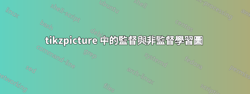
我想使用 來表示這兩張圖tikzpicture。我不需要將它們連接在一起,如下所示,但我想要類似的東西。

我可以產生如下散佈圖:

我有兩個獨特/不同的集群。我想在監督學習範例中繪製線性可分線,同時在無監督學習範例中繪製聚類。
此外,擁有顏色/更大的點會很棒。
代碼:
\documentclass{article}
\usepackage{pgfplots}
\begin{document}
\begin{tikzpicture}
\begin{axis}[%
axis lines = left,
xlabel = x,
ylabel = y,
]
\addplot[only marks] table [%
x = x,
y = y,
col sep = comma]{
    x, y
    %cluster 1
    2, 3
    3, 5
    4, 5
    3, 8
    5, 9
    3, 2
    5, 6
    6, 6
    7, 9
    10, 4
    11, 5
    9, 4
    %cluser 2

    20, 10
    21, 12
    24, 12
    25, 13
    27, 14
    22, 13
    23, 15
    25, 10
    15, 14
 };
\end{axis}
\end{tikzpicture}
\end{document}
答案1
您可以使用scatter/classes不同的方式格式化兩個簇中的點,但將其分成兩個更容易\addplot。要設定格式,請使用 eg \addplot [blue, only marks, mark=*, mark size=5] ...,我想這大多是不言自明的。
對於直線和圓,這幾乎只是使用普通 TikZ 指令的情況。請注意,預設情況下,如果您在環境\draw (x,y) ..內部執行此操作axis,x並且y不在axis.除非您可以a)使用(axis cs:x,y),或b)添加\pgfplotsset{compat=1.11}(或更高的版本號),在這種情況下axis cs成為預設版本。
進一步注意, acircle[radius=2]內部axis需要compat=1.11(我認為),但半徑再次位於軸座標中,因此在這種情況下它將變成橢圓形。您可以做的是在 內部定義一個座標axis,並在其外部繪製圓形。兩者都在下面的程式碼中進行了演示。

\documentclass{article}
\usepackage{pgfplots}
\pgfplotsset{compat=1.11} % <-- added
\begin{document}
\begin{tikzpicture}
\begin{axis}[%
axis lines = left,
xlabel = $x$,
ylabel = $y$,
clip mode=individual % so things drawn by \draw and similar are not cut off
]
\addplot [blue, only marks, mark=*, mark size=5] table [%
x = x,
y = y,
col sep = comma]{
    x, y
    %cluster 1
    2, 3
    3, 5
    4, 5
    3, 8
    5, 9
    3, 2
    5, 6
    6, 6
    7, 9
    10, 4
    11, 5
    9, 4
    };

\addplot+[red, only marks, mark=*, mark size=5] table [%
x = x,
y = y,
col sep = comma]{
    x, y
    20, 10
    21, 12
    24, 12
    25, 13
    27, 14
    22, 13
    23, 15
    25, 10
    15, 14
 };

 % to be able to use axis coordinates with \draw directly you need
 % \pgfplotsset{compat=1.11} or a higher version
 % if that is not present, use (axis cs:4,14) instead of (4,14),
 % to specify that the values should be interpreted as axis coordinates
 \draw [dashed] (4,14) -- (25,2);

 % save a coordinate for use later
 \coordinate (c2) at (23,12);

 % the blue circle is drawn inside the axis environment, and in axis coordinates
 % hence it becomes an ellipse
 \draw [blue, dashed] (6,6) circle[radius=5];

\end{axis}

% the red circle is drawn outside the axis, so actually looks like a circle,
% but the radius has no relation to the axis coordinates
\draw [red, dashed] (c2) circle[radius=2cm];
\end{tikzpicture}
\end{document}
兩軸
有多種方法可以使兩個圖彼此相鄰。您可以tikzpicture一個接一個地添加兩個 s,或者您可以axis在同一個環境中有兩個環境tikzpicture,並將第二個環境放在\begin{axis}[at={(x,y)},....就我個人而言,我喜歡圖書館groupplot的環境groupplots,它用於製作軸網格。

\documentclass{article}
\usepackage{pgfplots}
\usepgfplotslibrary{groupplots}
\pgfplotsset{compat=1.11}
\begin{document}
\begin{tikzpicture}
\begin{groupplot}[
group style={
  group size=2 by 1,
  horizontal sep=1.5cm
  },
axis lines = left,
xlabel = $x$,
ylabel = $y$,
width=5cm, % <-- set size of axes
clip mode=individual, % to avoid \draws being cut off
title style={yshift=1mm, font=\bfseries\sffamily}
]

\nextgroupplot[title=Supervised learning]
\addplot [blue, only marks, mark=*, mark size=3] table [%
x = x,
y = y,
col sep = comma]{
    x, y
    %cluster 1
    2, 3
    3, 5
    4, 5
    3, 8
    5, 9
    3, 2
    5, 6
    6, 6
    7, 9
    10, 4
    11, 5
    9, 4
    };

\addplot+[red, only marks, mark=*, mark size=3] table [%
x = x,
y = y,
col sep = comma]{
    x, y
    20, 10
    21, 12
    24, 12
    25, 13
    27, 14
    22, 13
    23, 15
    25, 10
    15, 14
 };

 % to be able to use axis coordinates with \draw directly you need
 % \pgfplotsset{compat=1.11} or a higher version
 % if that is not present, use (axis cs:4,14) instead of (4,14),
 % to specify that the values should be interpreted as axis coordinates
 \draw [dashed] (4,14) -- (25,2);


\nextgroupplot[title=Unsupervised learning]
\addplot [blue, only marks, mark=*, mark size=3] table [%
x = x,
y = y,
col sep = comma]{
    x, y
    %cluster 1
    2, 3
    3, 5
    4, 5
    3, 8
    5, 9
    3, 2
    5, 6
    6, 6
    7, 9
    10, 4
    11, 5
    9, 4
    };

\addplot+[red, only marks, mark=*, mark size=3] table [%
x = x,
y = y,
col sep = comma]{
    x, y
    20, 10
    21, 12
    24, 12
    25, 13
    27, 14
    22, 13
    23, 15
    25, 10
    15, 14
 };


 % save a coordinate for use later
 \coordinate (c2) at (23,12);

 % the blue circle is drawn inside the axis environment, and in axis coordinates
 % hence it becomes an ellipse
 \draw [blue, dashed] (6,6) circle[radius=5];

\end{groupplot}

% the red circle is drawn outside the axis, so actually looks like a circle,
% but the radius has no relation to the axis coordinates
\draw [red, dashed] (c2) circle[radius=1cm];


\end{tikzpicture}
\end{document}